I have been looking at different types of timelines to get ideas of how I will be organising my timeline for my VCT project.
I have decided I am going to work with Dadaism and going to do a timeline about the artist Raoul Hausmann.
These are different inspirational images to try to see examples of timelines to try to see how I will create my timeline.

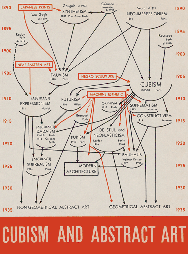
I really like the colour that has been placed in this timeline, although i think it looks a little too crowded, there is quite a lot of information in this timeline but the colours help divide the information a bit. The really like the circular shape, but I do not know why they did a much square shape on the top, I think it would have look more aesthetically pleasing if it had been all in a circular shape.

I would really enjoy to do an illustration timeline, I think that it works well with some subjects, but I do not think that with Dadaism this could be the best way to develop a timeline, although it would be nice maybe to apply some hand drawn illustrations somewhere in the timeline. I think that this could be a great method and a more interesting way of working with a timeline, I will keep this in mind for future works.
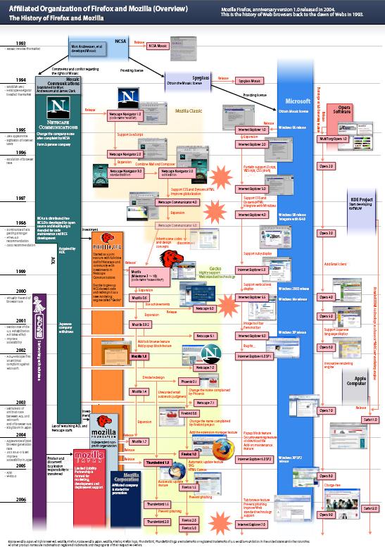
This timeline is a bit two crowded, I like the circles and how there are two different colours that indicate a different relation to each subject so it becomes easier for the viewer to identify what it is trying to relate each subject to. I think that without so many subjects it could work, although I think I am trying to go for something that is a bit more structured and has a bit of grid on it to keep all the writing we have to do in order, otherwise it can get extremely confusing.

I really like the grid in this timeline, and how it has images that compliment the text, although i might not concentrate so much information in a page. I think I would like to work with a grid timeline that has mainly images and the text compliments the images. I think that this timeline needs more white space although it is one of the examples that convinced me the most.
.
The vertical timeline is nice, and the grid and images work well, but I think I am more convinced working in a horizontal timeline rather than the vertical one.
I really like the graphic design work done in this timeline. The colours, the font and the aesthetics of this timeline I think that are really nice. Although if I want to work with images and text in my timeline it would look all over the place if I do not have some sort of grid in my timeline. But i defiantly want to use keep in mind the graphics in my timeline as we can see in this example.
No comments:
Post a Comment