Exploring image and text in Barbara Kruger’s work
I think the work that people do can be determined to some degree by where and when they are born, how they’ve been touched, the colour of their skin, their gender, and what’s been lavished upon or withheld from them. I think it took me a while to determine what it could mean to call myself an artist and how I could do work that was questioning, yet pleasurable for both myself and others. (Barbara Kruger)
In conceptual art, the combination of text and image is used to convey an artistic statement. Famous works of modern art often include the use of text as a visual medium, sometimes alone, and sometimes with image. Barbara Kruger is a conceptual artist whose work ‘is very graphic and consists of black and white photographs with overplayed captions set in white-on-red Futura Bold Obloque.’ The text that she overlies in the photos is usually declarative and makes common use of pronouns such as “you”, “I”, “we” and “they”. Her work normally tends to combine juxtaposed images with text containing a strong critic of sexism and circulation of power within cultures.
Kruger's instantly identifiable images, exploring the dynamics of power, identity, sexuality and representation, have helped shape a generation of artists.
Image is a visual representation of a group of concepts. An image enhances the imagination, portraying a single moment in time and leaving the audience to imagine the past and the future of a situation; the image becomes open to interpretation. In general, an image acts as a form of narration, substituting a written description for a single visual representation. ‘… As it is human nature to assimilate the most easily accessed information first, the dominant feature is likely to be imagery’. In our daily communication process we focus on the visual aspects; the movement, body language or facial expressions. When we see these characteristics in a static image it tends to draw our attention. Visual themes that stir emotions and aspirations attract more interest. Emotional or shocking themes tend to take hold of a visual priority among images that are less significant to our society. Image can be created with diverse mediums, including film, photography or animation and thus create a different experience both aesthetically and technically.
Text is the arrangement of words organized into a body; it is the translation of language into a written system. Text is another form of communication in which you can visualize an object without the use of an image or the use of spoken language. We have reinvented the written system to design new forms of visual expression with text.
Typography is the arrangement of text on a page that emerges in visual and written communication. It can have the ability to create an impact among the audience about the topic being discussed. It depends on the combination of font, size, spacing and colour that creates a visually impacting representation of a specific theme. The physical characteristics such as font, letter spacing or colour have to be taken into consideration because any alteration of one specific detail can radically modify the significance of the piece. For example, ‘large, bold, black sans-serif type is not necessarily more evident or powerful than small lightweight lettering’6. Barbara Kruger uses a very thick and powerful typography that is clear and eye catching due to the contrast created with the red background, which creates a visual impact to the viewer. Kruger uses pronouns to generalize the meaning of the message so that when the viewer reads the message he feels that the message is directed specifically towards them, rather than to some otherness that is not viewing the piece at the moment.
Depending on the composition, the piece can be image or text driven. Scale and page layout is used to manipulate the importance of a work; it is the part where the ‘hierarchical roles of both type and image interchange’. When you combine text and image the interpretation of the image is limited; the text focuses on the idea of the overall piece. Kruger employs the language of mass communication and has developed a visual personality as unified as any corporate identity, her work relates to themes like power and its uses and abuses. Her pieces are successful due to the control she has gained with image during her early works as a graphic designer.
Her art is motivated by a history of social involvement; in an interview and she said that she was interested in how identities where constructed and how stereotypes where formed and how narratives sort of congeal and become history.
.jpg) In this piece Kruger repurposed the photo of Norman Rockwell that she had taken from Saturday Evening Post issue. “There are moments where some of Kruger’s images just paste themselves over reality. It is the precision and lack of digressiveness that gives them force, a concentrated quality, a quality of ‘here is the issue and here’s what it looks like’ ” The images are straight forward both aesthetically and literary. At the same time the text can be problematic due to the use that she makes of pronouns puzzling the spectator; through the use of words such as “you” and “we” the spectator can relate to the work directly or experience it through a third person perspective.
In this piece Kruger repurposed the photo of Norman Rockwell that she had taken from Saturday Evening Post issue. “There are moments where some of Kruger’s images just paste themselves over reality. It is the precision and lack of digressiveness that gives them force, a concentrated quality, a quality of ‘here is the issue and here’s what it looks like’ ” The images are straight forward both aesthetically and literary. At the same time the text can be problematic due to the use that she makes of pronouns puzzling the spectator; through the use of words such as “you” and “we” the spectator can relate to the work directly or experience it through a third person perspective.
Her work speaks through to the audience through advertising media she “ creates an art of word and image built on the vernacular of mass communication, Kruger’s work seduces as well as informs”
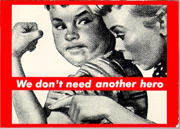
The first thing that the viewer can see is the black and white image that contains a girl viewing a boy’s biceps. When you first see this image, you get the strong sense of the feminist aspect of the idea. By itself the image does not have the same meaning as when you have both text and image in the same composition. The text limits the interpretation because of the written statement of the artist. “We don’t need another hero” clearly makes you think of the idea behind women not necessarily needing a man in order to take care of themselves. There is a visual contrast between the text and the image in which the image by its self would seen as if the girl would be admiring the man’s strength and supremacy, whereas the clash between the image and the text clearly generates a feminist critique. It is a critique that refers to ideology that has been imposed up until the feminist movement, which fought against the role of the man hero” clearly makes you think of the idea behind women not necessarily needing a man in order to take care of themselves. There is a visual contrast between the text and the image in which the image by its self would seen as if the girl would be admiring the man’s strength and supremacy, whereas the clash between the image and the text clearly generates a feminist critique. It is a critique that refers to ideology that has been imposed up until the feminist movement, which fought against the role of the man superiority. Kruger’s combination of both elements makes the viewer create a micro narrative.
 The image of the piece “You are not yourself” has been taken from a film. The fact that the images that she uses in her work are not taken by her is quite interesting; her way of editing them in order to give them a different meaning is very compelling. “She said that she was not interested in being a photographer, she stopped taking photos and started using found images because the latter were simply unbeatable.”
The way the text is displayed in this specific piece works well with the effect of the broken mirror. The greyscale gives the image a monotonous tone and the broken effect of shattered glass affects the facial expression of the woman. The broken mirror puts into question the emotion of the women not knowing if she is content or upset. The broken mirror is a reaction to the words “You are not yourself”, making you consider this phrase as being a rejection since “you”, referring to the general others, does not accept not being one’s self. The way the text is laid out, the black bold font “you are yourself” and the white small “not” can give the piece two meanings due to the scale and the contrast that she uses with the type. "I'm an artist who works with pictures and words. Sometimes that stuff ends up in different kinds of sites and contexts which determine what it means and looks like." (Barbara Kruger)
 “Your body is a battleground” was designed to support the right of abortion combining it with the idea of the construction of female identity. “Her art is motivated by a history of social involvement, her mission is constant and the commitment in her art and the society”
On the one hand she claims that the search of women is “to be complete” just the way patriotic mentality imposes this idea, and on the other hand she claims women’s rights over their own body. Visually, this piece contains a lot of contrast; having half of the picture in a negative gives you that impression of a woman in different ways of thinking
The image combined with the text raises questions to the viewer due to the strong sentence and questions abortion and women’s reproductive rights.
When we have images by themselves we tend to let our minds flow imagining ourselves in a situation, or feeling an emotion that we can relate to, or simply imagining it. Combining text with an image gives it more meaning; the artist wants you to think on a specific idea or a more personal point of view. Barbara Kruger uses simple juxtaposed images and adds one sentence to images, which makes the central idea behind her pieces, and communicates with no trouble to the viewer. She re-contextualizes imagery and manipulates it creating pieces that are so powerful that it makes us question our life style and our values because of the emotions that she is able to take across in each of her works.
Bibliographies
Book
- Knight C , Glaser J. 2007.Create Impact. Volume 1. Rotovision
- The Buehler Family Foundation. Irmas A. The MOCA Projects Council. 2000. Thinking of You, Barbara Kruger. Printed in Germany
- Poynor Rick. 2004. Communicate. Barbican Art Galleriy. Laurence King Publishing.
- Primo Angeli Inc. 1996. Making people respond. Madisson Square Press
Websites
- Art:21.Mary Boone Gallery http://www.pbs.org/art21/artists/kruger/card2.html >( Accessed November 23-2009)
- Kruger. Barbara (Acessed 27 November 2009)
- Skarsted Galleryhttp://www.skarstedt.com/index.php?mode=past&object_id=103> (Accessed Dec-1- 2009)
- The Board Art Foundation, Barbara Kruger < href="http://broadartfoundation.org/artist_43.html">http://broadartfoundation.org/artist_43.html> (Accessed 1 Dec 2009)
- MoMA The Collection of Barbara Kruger work http://www.moma.org/collection/artist.php?artist_id=3266> (Acessed 1 Dec 2009)
Images


