Wednesday, 28 October 2009

Hannah Höch


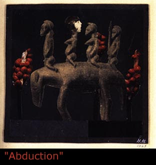
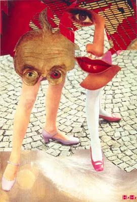
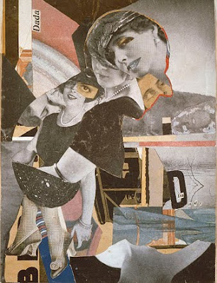
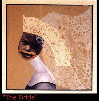
Having the 100 collage project I have been looking at different artists that their work is based on photomontage or collage. I borrowed a book from the library that is only collages, and the ones from Hana Höch where really unique. I like the way she used the space in her photomontages, I started reading a bit about this
artist because I had not seen her work before, and I wanted to understand her work. She was a german artist that
studied glass design and graphic art to please her father in the Collage of Arts and Crafts in Berlin. Around 1919 she
became influenced by the Dada movement in Berlin, she became friends with other very influential artists such as
Raoul Hausmann and developed a relationship with Kurt Schwitters and Piet Mondian.

Tuesday, 27 October 2009

Type Workshop


The final exercise was to chose a interesting part of a letter, or a font and sort of experiment and look at the differences between different type analyzing the specific part you chose. I chose the descender of the letter "G" and compared it to all of the types that where given to us to work with and placed them from serif to sans serif. I started to realise that the serif descender of the letter"g" was quite similar and it slightly changed. It was not really noticeable, but since I drew them I could tell the difference even more. They have asked us to push this further and I have found a lot of different type and will compare as many descender of "g" that I can.

These are a bit of examples of the class work that was displayed, mine is a bit in the corner and I will have to upload a picture of the name I did this day. I think that all of the names had something quite interesting, and we discussed all the different possibilities and interesting facts of the designs that the people in class created.


This was our type workshop, I really enjoyed it because I knew that a type phase was classified into fonts and that there where families being regular, italic, light, bold , black , condensed and extended; but I did not know the correct terms for serif and sans serif type phase. I knew there was a correct term but I did not really know it until this lecture. I quite enjoyed it really, we did an exercise on transparent paper and different fonts, the first thing we had to do was to chose a font that would describe us as a person. I chose "Futura Book because" I prefer sans serif type, I think it is less serious and a bit more modern and it was a simple and still very clean type that I found would relate with my personality.

John Baldessari


This picture is one of the six pictures that where in the exhibition, I think there where six I am not quite sure, and in the bottom it said that there where the only ones that the three red balls do a straight line, I think it was out of thirty three tries.
This is a picture I found in the internet of the "CALIFORNIA" type that I saw in the exhibition. It is quite interesting because the first page before the pictures are actually the coordinates where he took the pictures of the letters. I think the whole thing is a very nice composition because the pictures also relate to the word, because all of these images where taken in California.


I went to the Tate Modern quite recently going to go to see the POP LIFE exhibition, and when I finished to see it I decided to go into John Baldessari's exhibition just to look around. I had never seen his before and I was really amazed when I saw it. I was really impressed on his work, the way he uses film in order to create rebus, or the ways he used air brush techniques to create a new style of advertisement was really interesting. I thought that the most interesting pieces where the ones that where he was juxtaposing words with letters. There was a piece that geographical places that resembled the word "CALIFORNIA" and what I found quite interesting was the composition, because the pictures looked like they where actually taken from an airplane. The pieces that where quite interesting as well where large images where he juxtapose the faces and put colourful paint on the faces. There was a piece that I can not remember the name that was a lot of different guns pointing clockwise, and in the middle there was a picture of a couple kissing and a sort of chaotic incident in the streets. The way he edited these pictures was very interesting, and it gave me ideas for the collage project. A lot of his work had Rebus, Juxtaposing, and Editing, and I found his work quite an inspiration for my 100 collages.

Idea Generation Process


100 Collage Project


These have been the images that I have cut out of magazines , I am trying to cut out as images that I find interesting first and lay them out nicely in order to be able to do my collages quicker easier.


These have been images that I have found in the books that I bought in a old book store in Kings Cross. I put an example of images that are inside these books. They are quite interesting because they are old drawings that will look nice with the cut outs of magazines that I have found. I am going to photocopy the images that I find more interesting of these books and then cut them to use them in my collages.


These images are a couple of examples of the different magazines that I found in a book store in Leister Square. The reason why I put different images without cutting them, is because I still have to photocopy some images that are in both sides of the page. But I think it is interesting because the images that are in these magazines are very different than fashion magazines and other magazines that I have found, so it is quite interesting to see there is a lot of illustration images that will look quite nice with the collages. It is to have more variety in my collages and trying to use as many different mediums and images as possible.


These are some postcards that I bought, and I think they are really nice because they old picture postcards of people in hollidays and they are black and white. They are very nice because the paper is slightly thicker and this will help me create sort of 3D layers which I think is quite interesting and might look very good.


These have been the images and magazines that I have recently collected


I have been cutting out images of different types of magazines and news papers for the 100 collage project we have to hand in december. These where the first cut outs that I did and I have been collecting different images of all sorts of magazines. I started to cut out the fashion magazines, but I found them quite boring because they have a lot of pictures of women and clothes and I was interested in finding different types of images. I have been looking for old books because I want the old illustrations that are in those books. I have found a small book store in Kings Cross and they told me that next week probably I will be able to get some of these books so I am waiting to collect a variety of images that will help me do more interesting compositions.